
I believe that when honest art is merged with a skill set, the output is beautiful. Back in India, design was always something that intrigued me. Trying to understand the thought and vision behind a visual depiction of something always excited me. Be it the arrow from A to Z in the Amazon logo or the 31 in the Baskin-Robbins logo depicting the 31 flavours they offer, everything somehow made sense to me.
Although I had no technical education in design or art, the world of logo design always pulled me towards it. Many times, I would just sketch something on paper to see if it connected with anything around me.
During my journey as the Creative Head of Emagin Entertainment, I came across an interesting project. A client who ran a family business in civil construction wanted to redesign his company’s identity. Mind you, Daman being a very small town, there was no concept of brands, just the name—face value, to be correct. Everyone knew everyone, and people would get work just through word of mouth, especially in the construction business.
So, I met this client once casually and explained what I did, my services and my vision. He was very interested in redesigning the company logo and eventually printing a new set of visiting cards.
The name of the company was ‘The Urban Developers’, a construction company that executed turnkey projects in housing, government projects and commercial buildings. The client’s vision was to create something clean and noticeable and to stay away from the clutter of logos in the business.
I also realised that the client had an inclination towards the colour gold. He mentioned that it made everything look rich and impactful. I feel that these are the kinds of questions one should be asking clients in the field of creative direction because you want to understand what the client needs. Of course, we can make suggestions, and we should give our inputs because that’s our expertise, but we have to ensure that the client is heard and their needs are addressed.
My designer and I brainstormed multiple options. We played with the words, their meanings and their visual impact. We sketched multiple options, used different colour shades and presented the final options to the client.
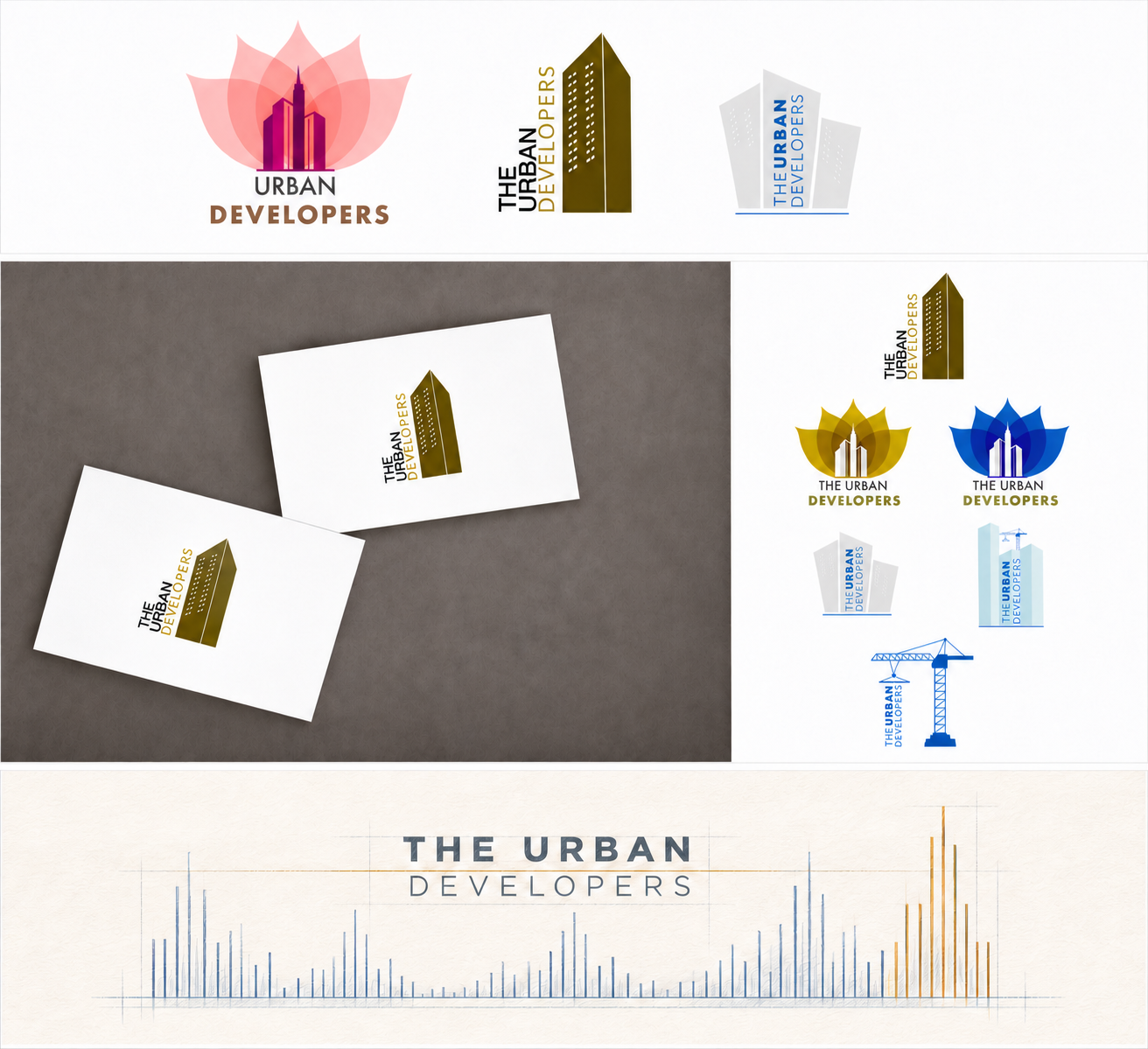
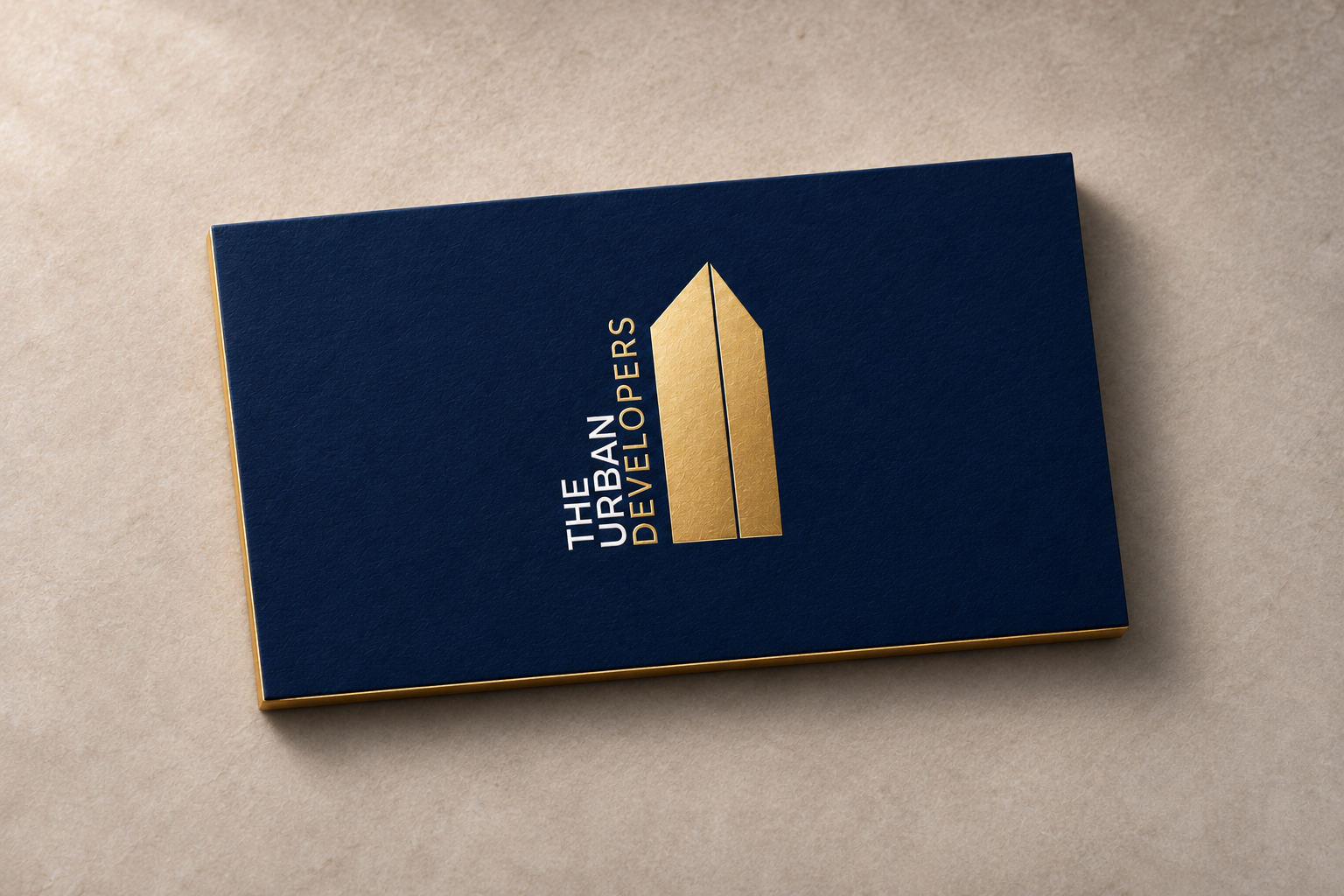
Taking the brief a step ahead, we suggested some options for visiting cards to the client. Rather than having a traditional visiting card, I showed him a sample of a visiting card with foiling on it to make the logo sharper. I gave the entire card a dark blue background so that the gold-coloured foil would stand out and create a very strong impression.
The client absolutely loved the idea. He finalised the logo, went ahead with my suggestion and, within a week, we delivered a new logo along with a different type of visiting card that he could share with potential customers.
I feel creative direction is about understanding the brief, having a conversation with the client, polishing ideas along with your team and delivering options to the client. This makes the entire experience memorable and comfortable for the client.